How to improve
landing pages
23rd September 2023
Online marketing is a numbers game. Marketers are crazy for them. From how many clicks a social media ad received to how many times an email was opened, everything has a metric. But while clicks are good, no metric is more important than the conversion.
In this post, we’re going to talk about how to increase conversions by creating user-friendly landing pages. But first, let’s discuss that term, ‘conversion.’
WHAT IS A CONVERSION ANYWAY?
‘Conversion’ (or conversions) is a term that is frequently used when talking about digital marketing campaigns. They come in various shapes and sizes and mean different things to different people.
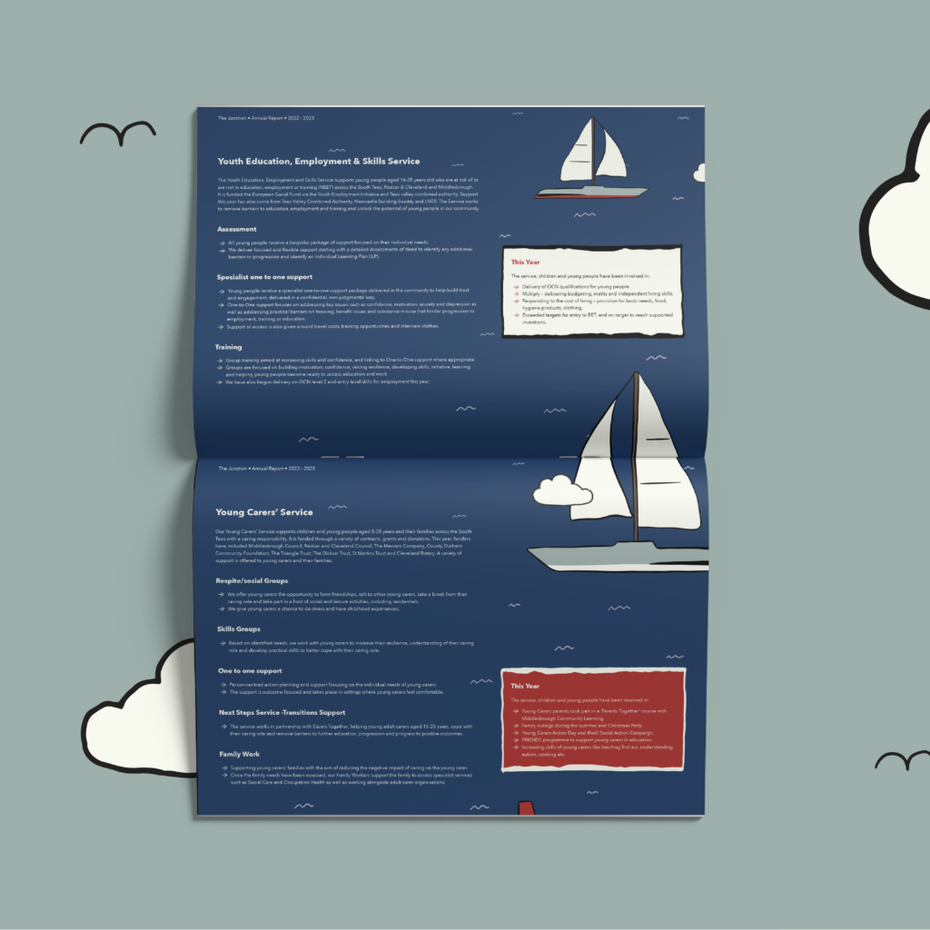
We like to describe conversion as “someone doing something that has a real business value”. This could be submitting an enquiry form, buying a product (if you’re e-commerce), registering for a webinar or downloading an ebook (like the one below we created for The Junction Foundation).
These are all things that would effectively turn a visitor into a strong lead or customer for your business to engage with. While you can (and some companies do) count ‘softer’ actions as conversions, we’ve made an active decision against doing this for our clients – and would recommend you do the same. By softer conversions, we’re referring to things like counting five minutes or more on a website as someone converting or the fact that someone has viewed a certain page. We know there are arguments for these, but for us they aren’t tangible enough to prove that a visitor has real business value to your company.
Take action: before you spend any time or money on your marketing, make sure you’ve defined what your conversions are. Ensuring you’ve got a system in place to record and report how many people have ‘converted’. Want some feedback on your chosen conversions? We’d be happy to chat; send us a quick message.
WHAT IS A LANDING PAGE?
A landing page is typically the page where you’ll usher people to online. This could be from social media posts, PPC ads (such as Google Adwords), or from other pages on your website such as a blog post or other call-to-action. Landing pages are sometimes referred to as ‘squeeze pages’ because they are there to squeeze as many conversions as possible from the traffic that has landed there.
SO, WHAT MAKES A GOOD LANDING PAGE?
A good landing page has a number of features that help them convert people into leads or customers. Let’s explore how to improve landing pages (or create one if you don’t already use them).
1. HEADER & FOOTER
By the time someone reaches your landing page, they are at the end of the user journey. The link that has to lead them there will have a strong call-to-action attached to it, which the customer clicks with the intention to convert.
A common design feature of good landing pages is that they typically don’t have a full header and footer. They’re simplistic and avoid elements like links, phone numbers and other ‘distractions’ that could lead people away.
An example: Amazon
A well-known example of a company using this technique is Amazon. You’ll notice that once a visitor gets through to their checkout page, the header and footer are removed and replaced with a simplistic header and footer. All distractions are removed so that the user can carry out what Amazon wants them to do: pay for their goods.
2. ONLY EVER HAVE ONE PURPOSE
Your landing page should only ever have one objective (i.e. download this ebook, register for this webinar, book this session). This helps keep the user’s attention focused on doing what you want them to do. It also allows you to focus the other content on the page towards strengthening your offer and reinforcing why the user should convert.
Giving people options will dilute attention!
3. SOCIAL PROOF
Do you know the saying that “there’s no better introduction than a recommendation?” Well, the same can be said online. ‘Social proof’ is a buzzword that effectively means a recommendation online.
This could come in the form of a tweet on the page endorsing the product, a person or company sharing it, or even be a snazzy popup showing how many people have viewed the product in the last 24 hours to give the page credibility.
An example: Hotels.com
Hotels.com is a hotel comparison website that uses multiple elements of social proof in their pages. One element that we particularly like is the yellow popup that shows visitors how many people are looking at that hotel right now.
In addition to this, they also have a large sidebar showing reviews from TripAdvisor. As a well-recognised name in the travel industry, this is well accepted as genuine and honest feedback from real people — i.e. social proof.
4. A SENSE OF URGENCY
You’ll often see on landing pages for things like webinars or sales, that they’ll use a count down timer. These are there to create a sense of urgency; which makes people think that they need to act now or risk missing out.
How often have you seen something that you think looks really good online and had the thought process that you’ll come back to it later? Or visited an e-commerce website and jumped off the page because you can’t be pestered going through the checkout process?
The point is: people do things on their time. Unless they feel like, if they wait, they’re going to be affected in some way. This could be (in the case of things like a webinar) missing out completely or knowing they are going to pay a higher price in the future.
An example: SAP User Group
Here’s a landing page example from the SAP User Group, used to promote one of their conferences. The ticker down style timer was used to create a sense of urgency and encourage people to sign up then and there, rather than wait.
Fear of missing out (FOMO) is a very real human emotion and one that you should try to work into your marketing wherever possible.
5. A ONE-PAGE PROCESS
Where possible, your landing page should be a one-page process for someone to convert. If this is someone checking out, try to get all of the details you need from someone on a single page.
When someone gets to your landing page, they’ve already been on a journey — either through your site or by clicking through from a post on social media. It doesn’t make sense to now ask them to bounce somewhere else to finish what you’re wanting them to do. This is especially true when looking at things like checkout processes or enquiry forms.
Try not to need people to repeatedly click “next” to continue entering details.
6. MULTIPLE CALLS-TO-ACTION
One thing nearly always missing from landing pages that we review is multiple calls-to-action. Calls-to-action are typically buttons, positioned on a page to get people to do what you want them to. Here is the thing, though: because of the amount of information you want to get onto a landing page, users are required to scroll to consume all of the content, especially on mobile.
We recommend having a call-to-action under each section of content on your page. These should differ slightly in terminology each time. For example, one button could read “Sign up”, another “Download your copy now” and so on. The chances are that one of the pieces of information — social proof, marketing video, bullet point benefits, etc. — will be the element that tips someone over the edge from considering to converting.
Don’t have people looking around for the form.
People are lazy, make it simple for them with multiple buttons and links in the text. We suggest adding functionality that scrolls the screen back to a point where the form is visible after clicking a call-to-action. This saves the user from scrolling up and down the page.
7. DIGESTIBLE INFORMATION
This is especially prevalent if you’re running ads on social media platforms that click through to your website. According to Time Magazine, most users stay on a website for less than 15 seconds before clicking away. That’s all you have to tell people about your offer and convince them to act.
Does your landing page quickly convey the benefits? Granted, this is slightly different in an e-commerce scenario if you’re looking at the checkout pages, but even so, do your product pages say why your product is the best concisely? Or are people having to dig through your descriptions and text to try and decipher if they should convert?
Do the stranger test: show someone your landing page on an iPad. Let them look at the page for five seconds and ask them if they can quickly convey the key take away points (normally benefits). If they can’t, consider re-working your landing page. This could be through the use of different fonts, headings or simply better copy.
There we have it, seven things your landing page should include. Now, we’re not suggesting that every landing page you produce should have every one of these benefits checked off, but if you aim for the majority of them, you’ll be onto a good start!
Hopefully this guide has helped with some ideas about how to improve landing pages. If you would like to discuss how you might go about generating more enquiries online, reach out, we would love to chat.