The Greatham Foundation
INDUSTRY CHARITY
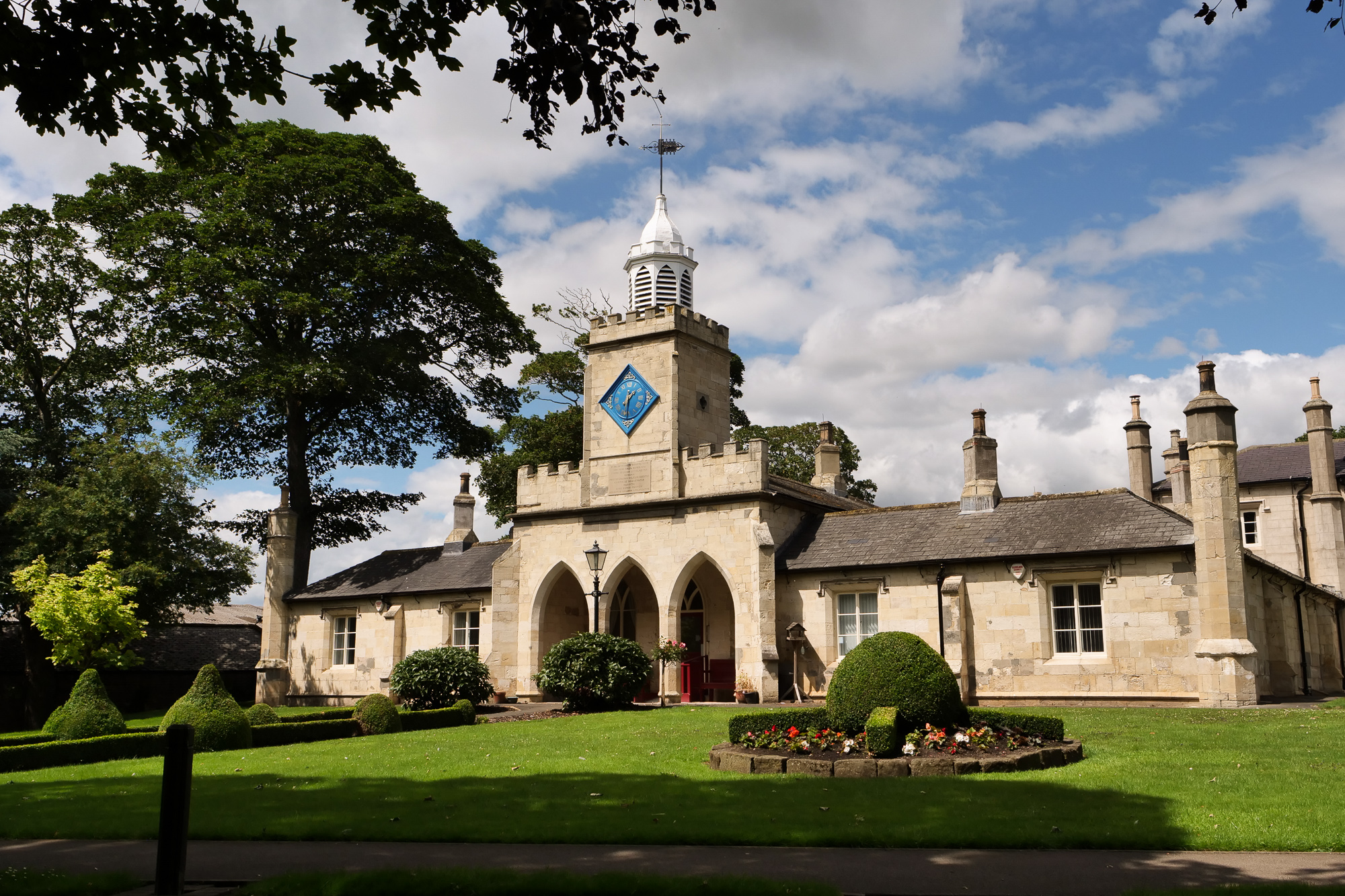
Formerly known as The Hospital of God, this 750-year-old charity was entering a new chapter. The decision to adopt the name The Greatham Foundation had been made. The challenge was to ensure the transition brought clarity, unity and confidence to an organisation with deep roots and complex services.
The Challenge
The Hospital of God carried heritage, but its name no longer reflected what the organisation actually did. It was not a hospital. It was not a religious body. Staff often found themselves explaining what it wasn’t before they could explain what it was.
Stakeholder interviews revealed something more structural. Individual services were respected and valued, yet the wider organisation felt fragmented. Sub-brands had evolved over time and were operating with limited connection to the parent charity. Some teams identified more strongly with their own service than with the organisation as a whole. Externally, awareness was largely confined to those already connected to the charity or local to Hartlepool.
At the same time, the charity operated in a competitive and increasingly polished care sector. Larger providers communicated clearly, presented confidently and invested heavily in their digital presence. The Greatham Foundation needed to feel modern and credible, while protecting the trust built over centuries.
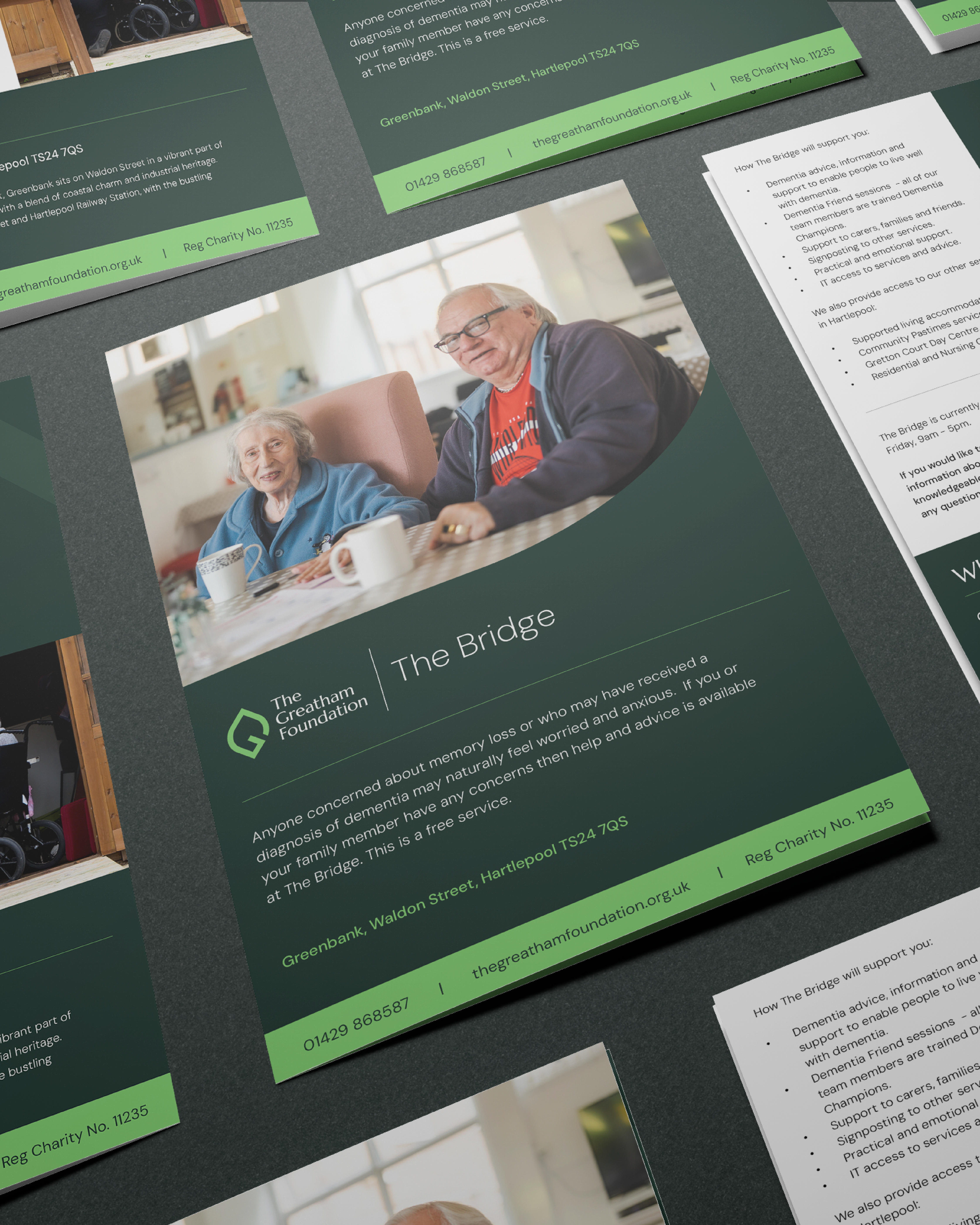
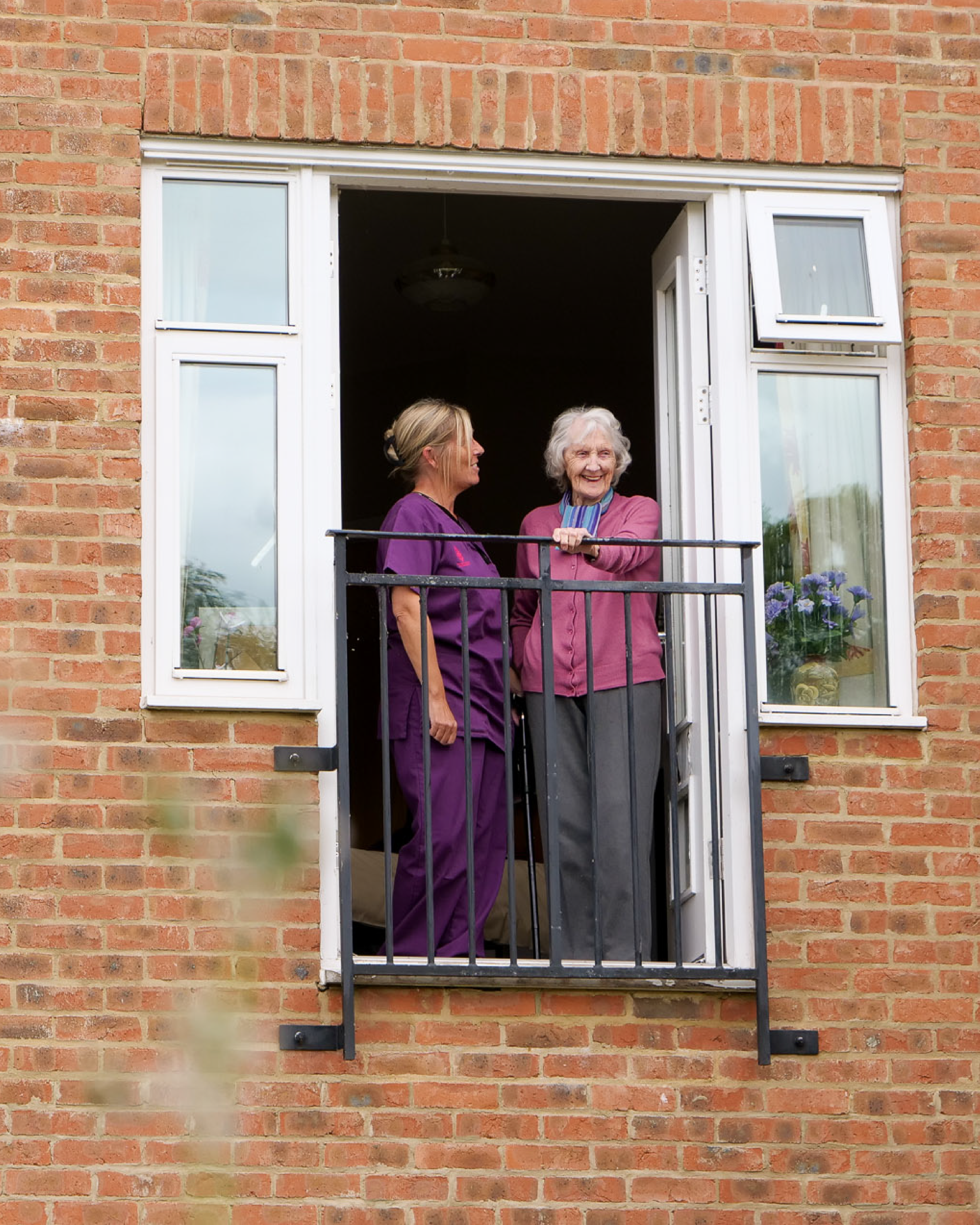
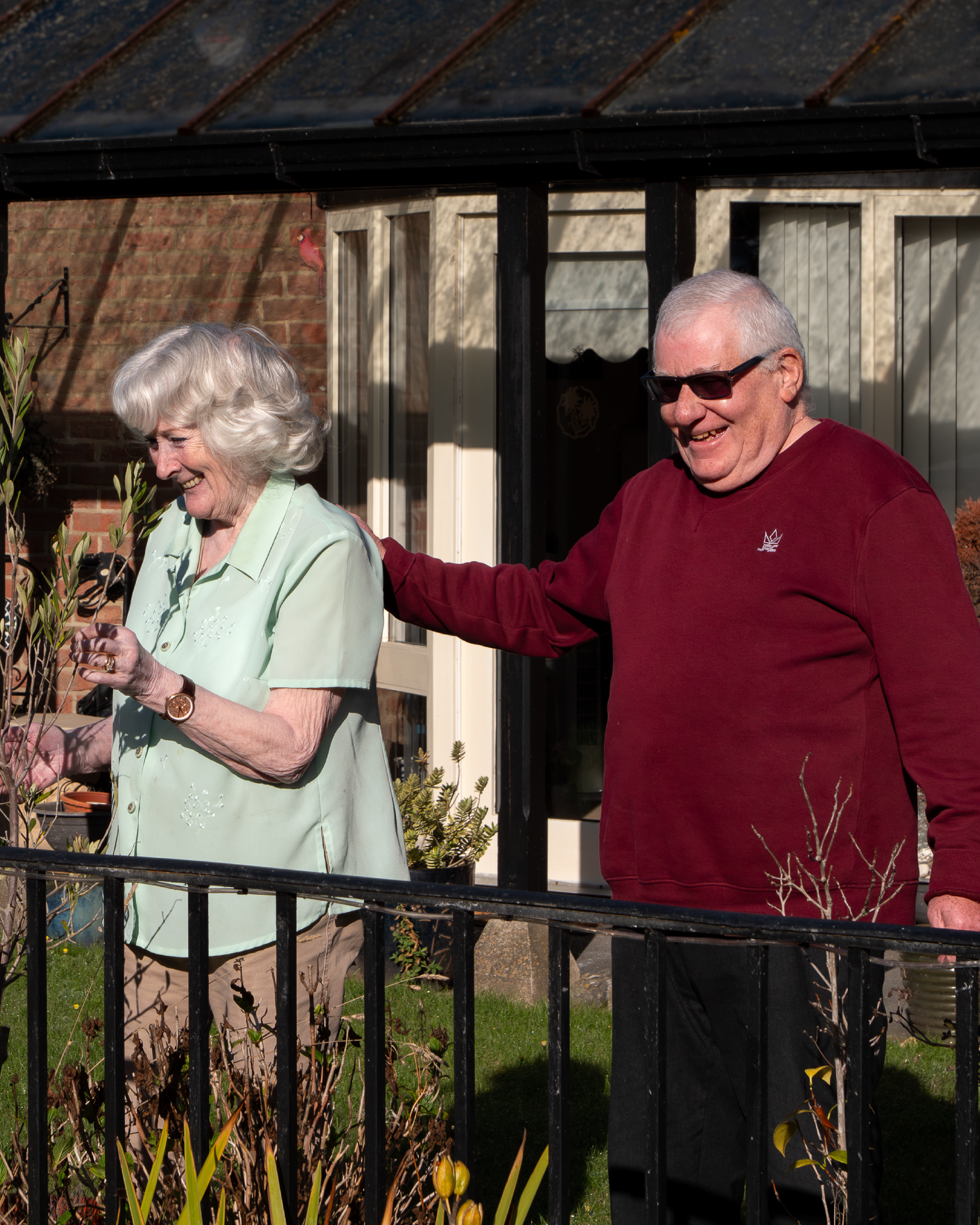
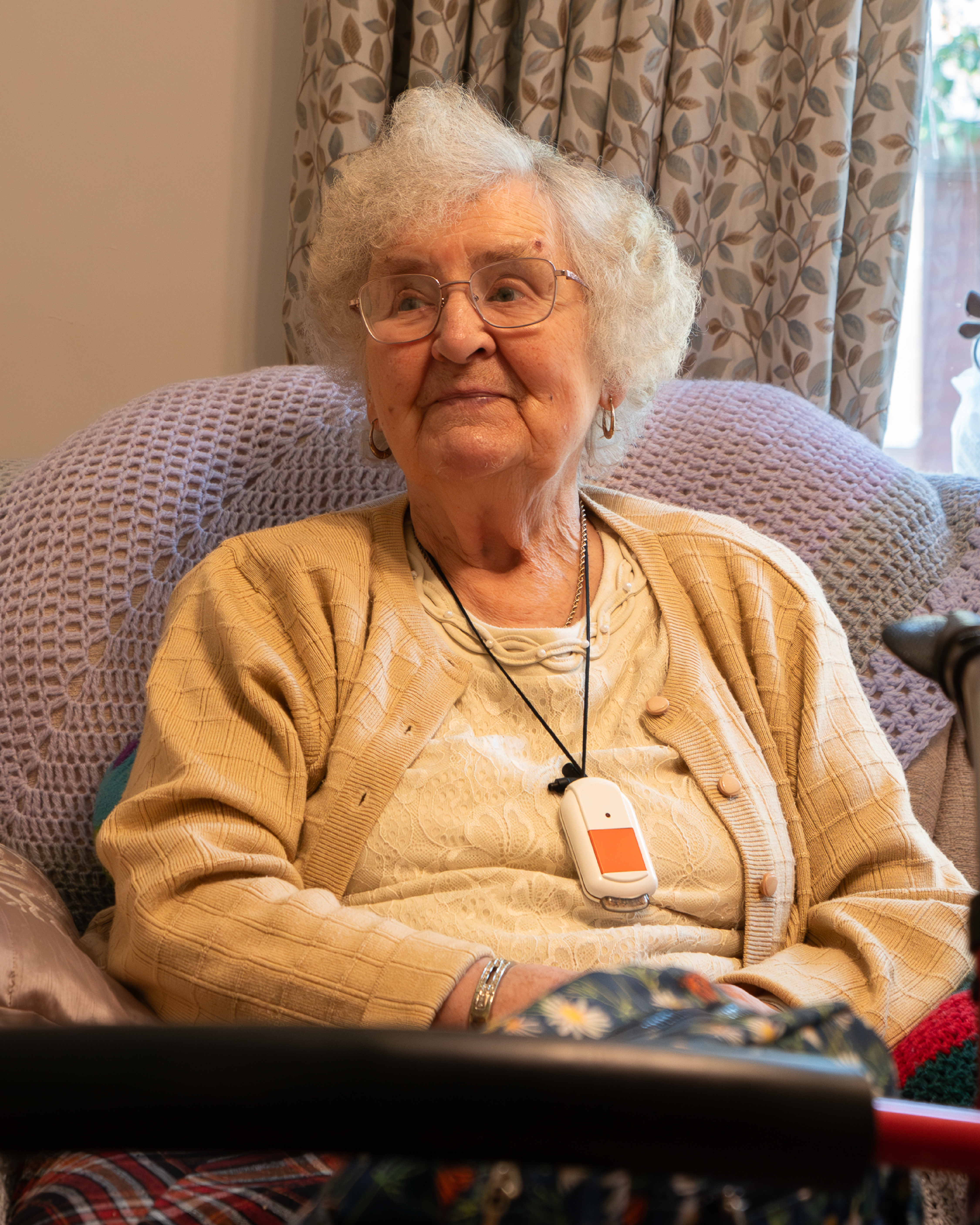
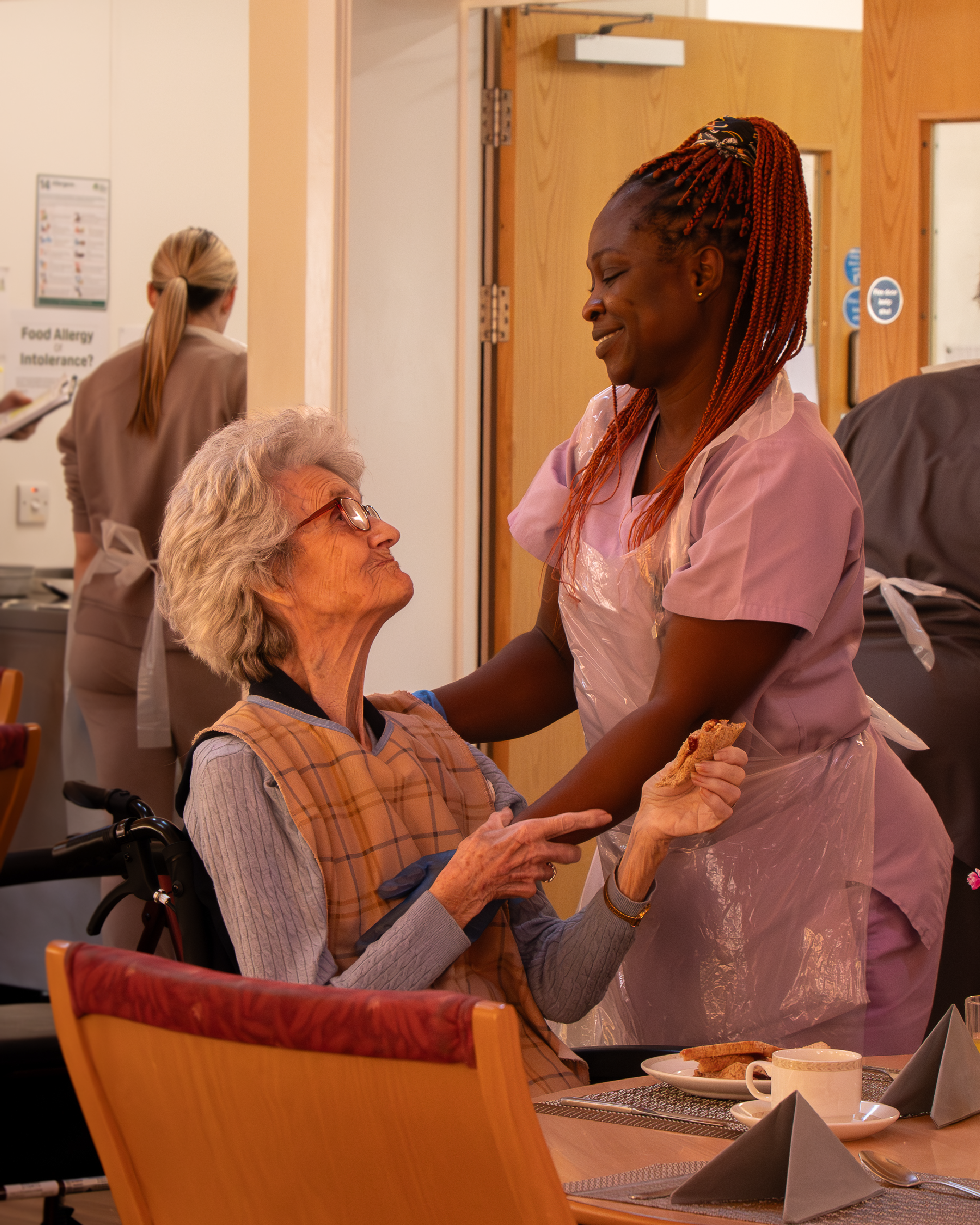
The rebrand had to unify multiple services, respect history, reassure long-standing supporters and clearly articulate a broad and sometimes misunderstood offer. This included residential care, community dementia services, almshouses, property management and a grants programme.
This was not a cosmetic exercise. It required organisational alignment as much as visual change.
The Result
We delivered a full strategic rebrand built around cohesion and clarity.
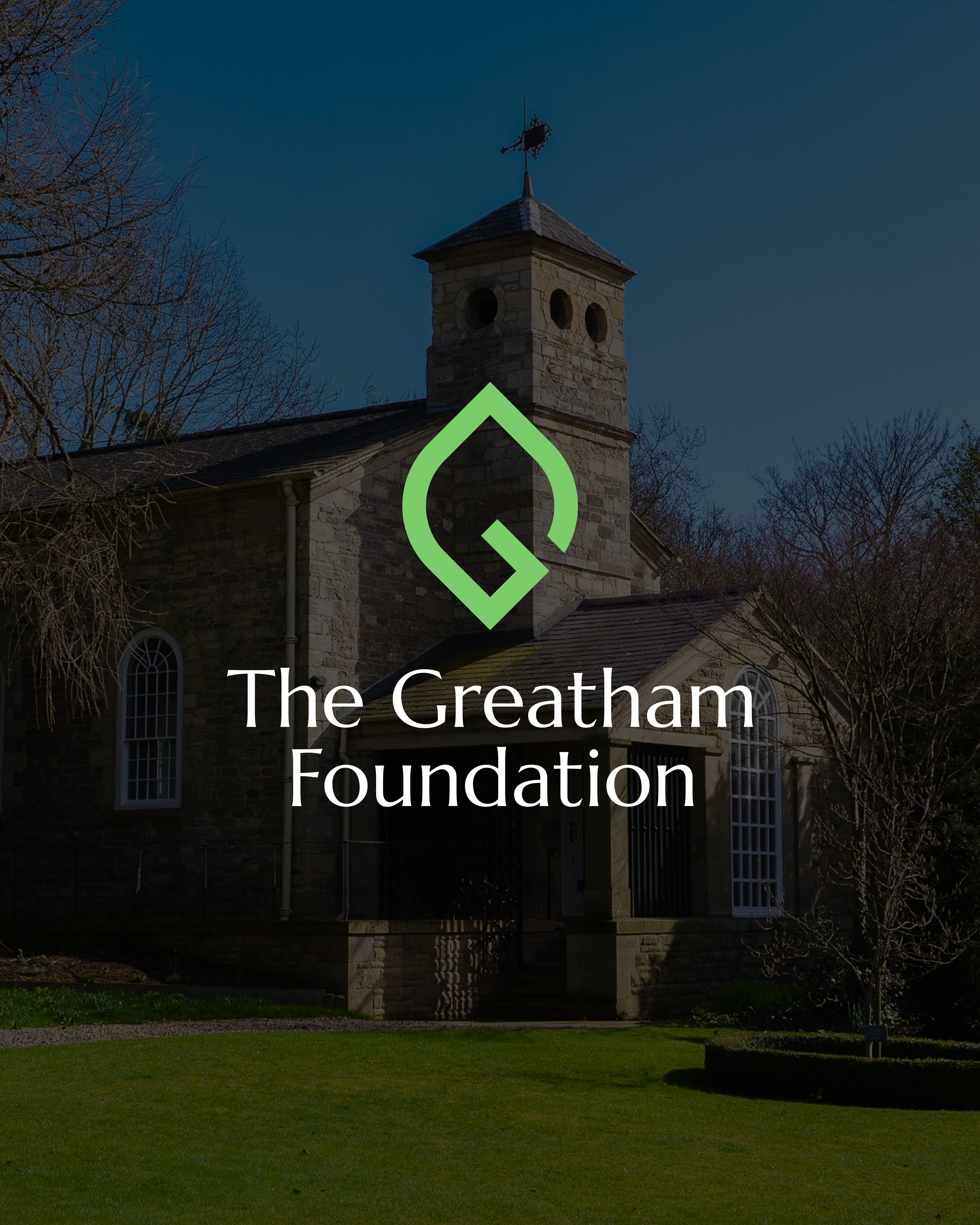
The new identity balances heritage with modernity. A refined serif logotype references traditional inscription forms, while a geometric symbol draws from the historic crest and subtly forms the letter G. The result is recognisable, contemporary and grounded in the organisation’s story.
Green became the central colour palette. Beyond aesthetics, it reflects calm, reassurance and dementia-friendly design principles. The palette supports accessibility, visibility and emotional comfort across environments and materials.
A unified sub-brand structure was introduced so services such as The Bridge, The Heathers, Minerva House and Community Pastimes sit clearly under one parent identity. This resolved internal fragmentation and strengthened external recognition.
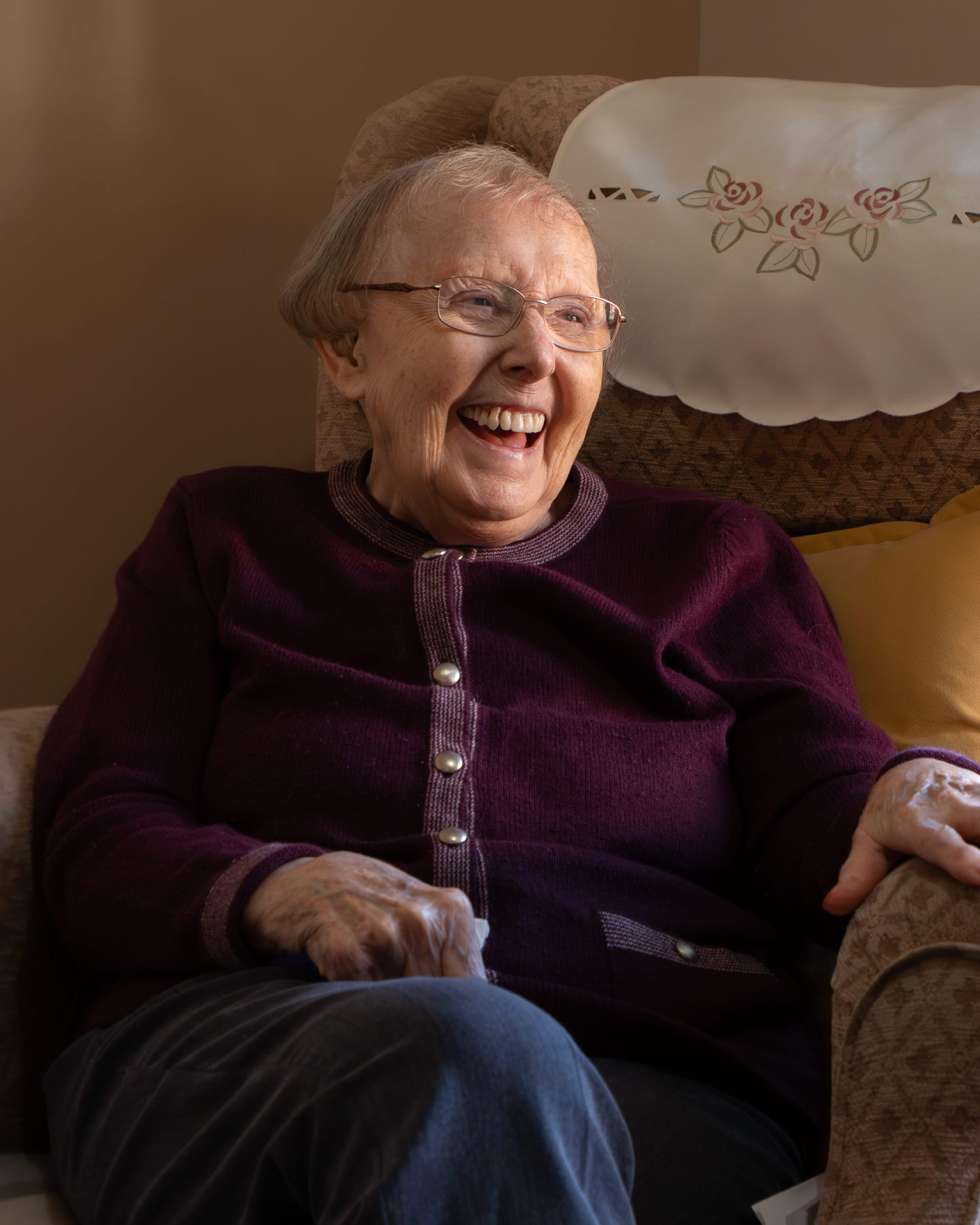
We developed a clear messaging framework aligned to mission, vision and values. The organisation’s role in supporting and empowering older people and those affected by dementia is now articulated with confidence and consistency.
The brand was implemented across a new website, printed materials, social impact reporting, service brochures and launch communications. National press coverage supported the transition and reinforced the scale of the moment.
The outcome is an organisation that feels aligned internally and confident externally. The Greatham Foundation now presents as a modern charity with deep heritage, positioned to serve future generations with clarity and purpose.
“The team at Vove are a joy to work with. They spent time really getting to know our charity and brought their wealth of experience and knowledge to create a new functional, modern charity website and brand refresh that showcased our long heritage of care and support. With updated photography, they helped showcase our impact and bring our values to life. We look forward to continuing working with Vove on our charity’s rebrand.”
— Nicola Garrett, Head of Operations